Friday, April 30, 2010

DUST AND THUNDER


Revised final painting, where I closed up the crack
along the front of the skull. Now it's not
 so distracting, and you see a beautiful skull
instead of a skull that has a big crack in it.


Dust and Thunder, 30X40 oil on stretched linen


Greetings!
My latest painting is called "Dust and Thunder". I find that I don't paint many still life's, just because I don't find that the traditional subject matter of flowers or fruit interesting. But I could look at a scenes like this forever. A painting with history or a deeper meaning, and yet is simple at it's very heart. In this scene, just a Navajo blanket, a lariat and a buffalo skull. It's the whole history of the west in one scene.


sketch for Dust and Thunder


This painting will be included in Trailside's upcoming "Salute to Summer" show at their Jackson, Wyoming location. I'm planning on having 4 new paintings to be included in the show that kicks off the season in the Jackson Hole area in Wyoming. The tourist season starts the Memorial Day weekend. It's almost like someone fires a starting gun in the air, and the people and buses start streaming in. If you've not been to Wyoming in general or Jackson specifically, try to get there. It's one of the most beautiful places in the West.

Wednesday, April 28, 2010

MARIAH

MARIAH, 9X12 oil on canvas ©2010


Greetings!
I will be posting a 30X40 painting in the next day or so, but in the mean time, I did a small landscape painting for the "Salute to Summer" show opening in June at the Jackson Wyoming Trailside Gallery. I love how cloud cover can quickly come in and cover the peaks of mountains. It's what happened the last time I visited the Tetons in Wyoming. In the distance you could see that it was clearing and wouldn't be long till the sun was back. It was a very windy day, so I named it the name of the wind, the same as the old song of the same name. Total painting time, 3 1/2 hours.

When I first started painting landscapes, it would take me days to produce one of these. As usual, I was getting lost in the details, instead of concentrating on the light effect, which is the essence of so many successful landscapes. I would get lost in painting the pine trees, being a slave to my reference, instead of using my photos as a jumping off point. Now I paint my areas in as general shapes, puzzle pieces which fit into each other, leaving the details until the effect was there already. Decide wher your focal point is and let the other areas in your painting play seconds to it. I wanted the focal point of this piece to be the area highlighted in detail #3 below. It has the areas of biggest contrast, and most detail. Everything else should support it, not compete with it. Don't kill a painting with extraneous details!


I get a lot of positive feedback on the close up details I post. So, here are some close ups of some of the more interesting passages.....


Detail 1


Detail 2


Detail 3


Hope you find this post helpful and interesting. Thanks for checking in!! --Steve

Sunday, April 18, 2010

First String Daily Demo, Day 5

Hi Everybody,
Today is "Paint a Cowboy" day. Time to get the rest of the canvas covered. That means painting in the shirt, jeans, boot and hands.


The shirt is in as well as the hands and part of the jeans. Like in the rest of the photo, I've simplified the folds in the shirt. The things I'm concentrating on for the shirt is getting the proper values in the right places. And getting in the light effect. This means adding colors that the photos don't usually contain. As you probably know, photos are great for giving us details that (my mind at least) we have a hard time retaining, or an even harder time making up. And though, the computer monitor is better at getting the colors as close to the original as we can, it still is only as good as you can tweak it. And you can only tweak it as good as you understand what happens with light. It's why I paint on location whenever I can. Nothing is better at teaching you the laws of light. I've never really mentioned another reason to paint outside. Willingness to publicly fail. I find that it's a very humbling experience to paint on location. Nothing, and I mean Nothing, draws people to you like setting up a tripod and paint box. People who would normally never dream of talking to perfect strangers, feel completely comfortable walking up to an artist and starting up a conversation. I've found that the law of crappy attraction applies, at least for me, while I'm painting out. This means that people will be attracted to your easel only when you are struggling with a painting, and come up at the worst time. People never seem to even see me when I'm working on a painting that's going well. That will keep anyone's ego waaaay down. So, back to the painting at hand.... now I'm working on painting in the light effect.


Here's a detailed view of the shirt which has a good representation of the warms and cools in both the light and shadow areas. Since the light areas have a warm light source, most of the lights are warm.... yellows, oranges and such. But it's important to put in some grays and blues here and there to make the effect more believable. I keep the warms an cools close in value and the human eye accepts the temp changes. Lots of reflected light in the shadow areas, especially where the reflected light is bouncing off the shirt itself.


The jeans go in next. The thing I spent the most time doing here is painting the top of the jeans more blue, and transitioning the pant leg to have more dust down at the bottom. So it ends up being warmer down at the boot. Two reasons I'm doing this, even though the reference doesn't have this. It makes the scene more believable, since the cowboy should have more dust on his pants down by his boots, since there is so much blowing dust. And it keeps him from looking like he's been pasted into the scene. Also is doesn't draw your eye down to the foot, and keeps it at the focal point, where it belongs.

The shadow areas have a nice warm reflected light bouncing onto the leg and really helps to turn the edge. I'm also keeping the edges softer in these areas. This also turns the edge and keeps your eye moving.


Here's the complete figure painted in. The canvas now is completely covered.


The painting at the end of day 5. I forgot to mention that I also went back into the foreground dirt and added a nice thick area of paint to bring more excitement to the painting. The thicker areas of paint are usually the first things people see when they look at a painting. But that's usually one of the last things I paint.


Only now that the entire canvas has paint covering it, can I begin the process of refinement. Now I can begin to adjust and balance the values which are too weak or strong, warm or cool, hard or soft edges. This is always my favorite part of a painting. This will make or break it's success.


I darken the shadow area of the horse's breast and bring it's value up to where it belongs. I also start to work on the lead ropes, softening edges and refining lights and darks. In the next couple of days I will be concentrating on adjusting any of these trouble areas. Also it's time to start perfecting the anatomy of the musculature of the horses legs and hooves. Finding the balance between detail and simplification. I will also be concentrating on getting the fence and gate finished, as well as adding the background details. Lots to do, but it really is the fun part.

Now I wait for a couple of days till the surface of the thicker paint dries. Right now it's in that weird tacky stage and can't be worked on till the entire surface dries. Then I'll bring the paint back to it's true colors by coating the surface, but more on that in the next installment. Needing to let the painting dry is why I work on several paintings at once. See you in a few days...

Wednesday, April 14, 2010

First String Daily Demo, Day 4


Hi Everybody,
Time to move onto the dogs and main figure. I don't always wait till the end to do the main figure, but it just naturally flowed that way on this painting. The rest of the figures will have everything to do with how I paint the cowboy. Painting the others first will keep me from painting him too tightly. Yep, you can probably see a theme developing here, with me always talking about keeping it loose. That's because my tendency is to go directly into painting the details and getting lost in the weeds. By keeping it loose and waiting till the end to selectively add the details, I'm able to make adjustments and paint a more artistic picture. One that focuses your eye to the exact spot on which I wish it to land.


First Dog laid in. Not the perfect face or head, but close enough for now. I will come back and tweak it later, but all the info is there and I can move on to the next dog.


Second border collie laid in. It was very important to me that the back of it's body was obscured by a veil if drifting dust. Right now it's purely about getting to dog to sit back and be one of the last figures you see.


I'm happier with this guy's face and I won't have to do much fiddling with it. Once you get it right leave it alone. Remember, there ain't no undo button like there is on the computer. I've lost more good painting by messing with a passage than anything else. If it's right, leave it alone!


Here it is with the dogs in place. I still have a couple of hours, so I go ahead and start on the head of the cowboy.


Keep your shadow areas separate from your light areas. Remember to add your reflected light, but don't let it compete with the light side. You'll notice that I began to put in the shirt, but I keep the lay in in the shadows, always comparing this shadow value to the surrounding areas, like the face and the horse which borders his sleeve.


Here's a close up detail of the face. Nothing is labored over. Be clean in your value changes and remember that the reflected light which is bouncing off the underside of his chin is a version of what is causing it, in this case, his light purple/ blue shirt. It might look a bit funny now, but will be right when I paint in the light side of his shirt.

See you tomorrow!

Sunday, April 11, 2010

First String Daily Painting Demo, Day 2+3

Hi Everybody, day 2 begins and I'm ready to start in on the horses. The first horse I will do is the white one on the far right side. For some reason, I had a senior moment and did not photograph the end of the first day with the two horses in on the right side, so just know that at the end of the second day, I had worked in the red metal swinging gate on the right side and two horses on the right side.


Here's what the first horse looked like when it was laid in. At this point, all the values were pretty close to what I wanted them to be. It's really important to me to get the reflected light bouncing from the ground onto it's undercarriage. Almost everything you paint will have reflected light. The stronger the light source, the stronger the reflected light. Remember your secondary light is light that's just what its sounds like, light that's being reflected from another object onto your subject's shadowed area. It's never as light as the directly lit area. It needs to read like it's still in the shadows, so be careful with your values here.


Closeup view of the first horse. Keep it simple. Don't put in every detail there is. Be selective, strive for accuracy of shapes, value, and color temp. You can always make adjustments later, but be as accurate as you can without putting in too much detail. Details don't make a successful painting! Mood, story, values, composition and edges do! For me, the painters who are most successful are the ones able to paint accurately, yet with a looseness. I love paintings where it looked like the painter had a good time painting it.

Another thing about this stage is: I know I'm going to be obscuring the hooves and lower legs of the horses with dust, so I don't waste a lot of time putting in details which will just be obscured later. I know I will be dry brushing the dust over the hoofs, coronets and pasterns because it has a very believable look to it when it's done this way.


The head and neck of the second horse after the lay in. Again, accuracy of shape, value and temps. One of the things that helps make the horse more believable (or any object, really), is making sure to put in warms and cools. You can see on the forehead and nose that I put in purple grays along with the yellows and oranges.

Here's a more detailed view of what I'm talking about. You can see how the warms and cools work together here to make a believable painting. It also shows how very little detail was painted in. No individual hairs were needed to convey the idea that he has a mane.


Here's where I left it at at the end of day three. All three of the horses are laid in. The faces, heads and necks have the most detail. Saddles and tack have less and the legs/hooves have the least, but more than they will have when the painting will be finished.

Thanks for looking! Steve

Thursday, April 8, 2010

'FIRST STRING" DAILY PAINTING DEMO

Hi Everybody,
I'm now settled into my new studio and have begun painting again. For this entry, I thought I would post another painting demo. It's been quite a while since I did a demo, and I feel like it's time. This time around the painting is called "First String" I'll take you from the initial concept pencil and include as much of my thought process as I can include without putting you to sleep.


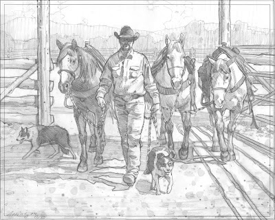
Here is the pencil I did to work out any kinks, and save me time on the easel. If I don't work out all the holes I have in my reference, I can spend a lot of time repainting areas, so, for me, it's time well spent up front. The main image of the horses and cowboy is from some reference I took at the Tucson Rodeo in February. The lighting was less than I deal and I had an idea to add some backlit dust to knock back the background and help with the focal point. The dogs were added to help with the concept and to highlight the partnership between cowboys, horses, and dogs. Besides, I like painting dogs. Hey, it's a weakness. The middle ground with the gate, fence and treelined background were invented using separate reference photos. Just enough of a background to give it a general place. It's not that important to the painting, so I don't overdo it with detail. When I put them all together, I find out if the drawing has enough merit to carry it into a painting. I originally was going to do this painting 18X24", but I decided that it would look better and have more impact at a larger size. So, the finished painting will be done at 24X30".


__________________


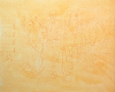
Once I'm happy with the pencil, I transfer the image to the toned canvas. I tone all my canvases using a color I think will work if I let little areas unpainted and poking through. For this painting, since it will be infused with dust, I used a thin wash of yellow ochre. When I do plein air work I usually use a thin wash of Cadmium Orange. It just depends on the painting.


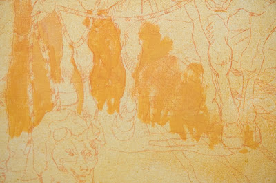
This is a close-up of the very beginning of the painting process. I included this photo to show you how thin the paint is at this point. If you look at the paint that's being loosely applied, you can still faintly see the drawing through the wash. The paint isn't like watercolor wash, it's thicker than that, but still thin enough to work over. This is important to me since I will be working over it while it's still wet.


My painting set up is pretty simple. The painting is on my easel. I've mounted my 30" display monitor on a wall swing arm mount. This allows me to work horizontally, or rotate my monitor 90ยบ and view it vertically, which makes for a much larger viewing area if the piece I'm working on is in portrait mode. On my monitor you can see my original photo, to which I've added the dogs in Photoshop. Also, I've got a photo of western fencing I'm using as generic reference. The lighting isn't right, but it lets me see the details of how it's constructed. And, I keep my sketch taped to the wall, to refer to when I need to see how I worked things out, just in case.


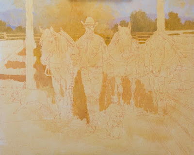
I'm only at the start of the lay in, but I wanted to show how simply it begins. Right now all I'm concerned with is getting the value relationships close. This block in goes pretty quickly, since I am not putting in any detail. In fact, I don't always put in the lightest lights or darkest darks. I don't know what needs to be detailed now, and if I put them in, I run the risk of making it too busy. The simpler the start the better. I can always add more later, but it's harder to take it out.


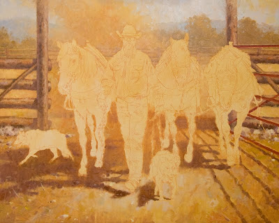
Here is where I ended up at the end of the first day. Simple shapes, simple values and most of my time was spent thinking about supporting the figures once they started to go in. The dust cloud behind my figures is going in well and I think will highlight the focal point and add the dramatic lighting I want. I'm not just painting the reference photo exactly like it is, I'm adding a light effect to make it a painting and have it create a mood. This painting will be all about attitude and confidence. Almost like gladiators walking into the coliseum, ready to do battle.

Round 2 will come tomorrow....